Sections
Sections are the large parts of a page. In the theme editor, click Add section to see the sections you can add to the current page, grouped by category. This page lists every section in Weft. For the blocks that go inside them, see blocks.
Most sections share three settings that aren't repeated below: Color scheme, Top padding and Bottom padding.
| Category in "Add section" | Sections |
|---|---|
| Banners | Hero |
| Made to order | Fabric strip, Fabric library, Showroom |
| Collections | Collection list, Featured collection |
| Text | Rich text, Multicolumn, Testimonials |
| Text and images | Image with text |
| Products | Shop the room |
| Product | Featured product, Product details, Complete the set, Recommendations, Recently viewed |
| Media | Video |
| Forms | Newsletter, Contact form |
| Advanced | Custom Liquid |
Some sections belong to one template and can't be added elsewhere. They're listed under Template sections.
Header and footer #
Announcement bar #
One line of text at the top of every page, with an optional link. No scrolling text, no rotation. It sits in the header group.
| Setting | What it does |
|---|---|
| Text | The message. |
| Link | Optional. |
| Link label | Shown after the text when there's a link, for example "Order samples". |
Header #
Logo, main menu, search, account, cart, and the country and language selectors. The settings are in three groups: Navigation, Country and language, and Behavior.
| Setting | What it does |
|---|---|
| Logo image | Without an image, the store name is set in the heading font. |
| Logo text | Leave empty to use the store name. |
| Logo width | 60 to 320 px. |
| Main menu | Links with sub-links open a mega menu. Sub-links with their own links become columns. |
| Main menu position on desktop | Right, next to the icons, or Center. |
| Show "Shop all" links in menus | Adds "Shop all Sofas" at the end of a mega menu and the matching drawer submenu, when the top-level link goes to a collection or to all products. Links to pages and other content never get one. Turn it off if your menus already have their own "All sofas" links. |
| Show collection images in mega menus | For top-level links to a collection. A "Main menu feature" block overrides the image. |
| Mega menu, drawer and search color scheme | Scheme for the mega menu, the mobile menu and the search panel. |
| Customer account menu | The menu shown in the account pop-up. |
| Show country/region selector, Show language selector | Shown when the store sells to more than one country or region, or has more than one published language. |
| Sticky behavior | Off, Always, or When scrolling up. |
| Transparent over a full-width hero | Applies on pages that start with a hero section set to full width. The header turns solid after a short scroll or when a menu opens. |
| Text and icons on the transparent header | Usually white. |
Main menu feature block: adds an image with a caption to one mega menu. Set Main menu link to the name of a top-level main menu link with sub-links, for example "Sofas". Up to 8.
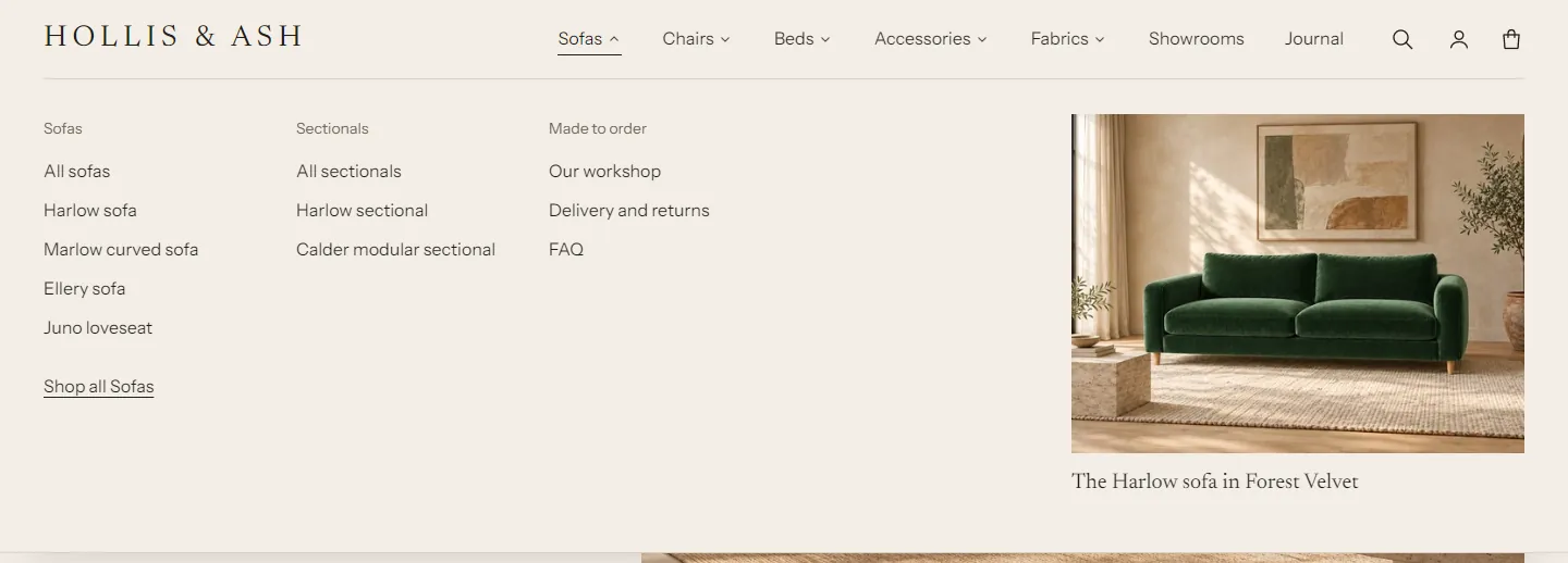
Menus with three levels work: top-level links open the mega menu, second-level links become column headings and third-level links are listed below them. On phones, the menu opens in a drawer with one accordion per top-level link.
Footer #
Blocks: About (heading, text and Show social media icons; one per footer), Footer menu (a heading and the menu to show; add several), Text, Newsletter (one per footer) and app blocks. The bottom row has the country and language selectors, the copyright line and payment icons.
| Setting | What it does |
|---|---|
| Show payment icons | Icons for the payment methods you've turned on. |
| Show Follow on Shop button | Lets customers follow your store in the Shop app. Shop Pay must be turned on. |
| Copyright name | Leave empty to use the store name. |
| Show country/region selector, Show language selector | As in the header. |
Home page and content sections #
Hero #
The large banner at the top of a page. Up to 6 blocks (Heading, Text, Button and others).
| Setting | What it does |
|---|---|
| Layout | Text beside the image, Full width, text over the image, or Text, image and material grid (a grid of fabric swatches beside the image). |
| Swatches in the grid, Fabrics from a product | For the material grid: how many swatches, and which product's fabrics to show. Leave the product empty to use the first entries of your fabric list. The grid is hidden on the live store until fabric entries exist. |
| Image, Mobile image | The mobile image is optional and shows on screens narrower than 750 px. |
| Image description | For screen readers. Leave empty to use the image's alt text. |
| Height on desktop | Small, Medium, Large or Fill the screen. |
| Image position | Right or Left, for the side-by-side layout. |
| Show the text above the image on mobile | For the side-by-side and grid layouts. |
| Shade behind the text | 0 to 80%, for the full-width layout. |
| Text alignment | Left or Center. |
| Color scheme | For the full-width layout, pick a scheme with light text. |
When the hero is the first section, its image loads first. Keep one hero per page at the top.
Fabric strip #
A row of fabric swatches beside a heading and buttons, for example "Over 140 fabrics" and "Order samples". Up to 5 blocks.
| Setting | What it does |
|---|---|
| Fabrics from a product | Shows the product's fabrics in their order. Leave empty to show the first entries of your fabric list. |
| Layout on desktop | Heading and buttons beside the swatches, or Heading, swatches and buttons in one row. |
| Fabrics to show | 3 to 10. |
| Image | Large image, then swatch; or Swatch image. |
| Show fabric names | Names under the swatches. |
| Rule above | A hairline above the section. |
Without fabric entries the section is hidden on the live store. See fabrics.
Collection list #
Category cards, for example Sofas, Beds and Chairs. Add one Collection block per card (up to 8).
| Setting | What it does |
|---|---|
| Heading, Link label, Link | Optional heading and a "view all" link. |
| Columns on desktop | 2 to 5. |
| Image shape | Wide, Landscape, Classic, Square or Portrait. |
| Caption | Centered below the image, Bar with an arrow, or Over the image. |
| Mobile layout | Swipe or Stack. |
Each Collection block has Collection, Image (leave empty to use the collection image), Caption (leave empty to use the collection title) and Link (leave empty to link to the collection).
Featured collection #
Product cards from one collection, with a heading and buttons above them. Up to 5 blocks.
| Setting | What it does |
|---|---|
| Collection | Until you choose one, example cards are shown. |
| Products to show | 2 to 16. |
| Columns on desktop | 2 to 5. |
| Layout | Grid or Carousel. |
| Mobile layout | Swipe or Two columns (grid layout only). |
Cards follow Theme settings > Product cards.
Rich text #
Centered or left-aligned text blocks, for example a short statement between two sections. Up to 8 blocks.
| Setting | What it does |
|---|---|
| Alignment | Left or Center. |
| Content width | 20 to 70 rem. |
| Rule above | A hairline above, for lines like "Handmade in 8 to 10 weeks". |
Image with text #
An image beside text blocks. Up to 8 blocks.
| Setting | What it does |
|---|---|
| Image, Image description | Leave the description empty if the image is decorative. |
| Image position | Left or Right. |
| Image width | Half or Large. |
| Image shape | Landscape, Classic, Square or Portrait. |
| Text alignment | Left or Center. |
Multicolumn #
Text columns, for example delivery, samples and guarantee. Add Column blocks (up to 6). Each column has an optional Icon (Swatch, Clock, Ruler, Delivery, Hand, Leaf, Location, Chat, Return, Sofa) or Image, a heading, text and a link.
| Setting | What it does |
|---|---|
| Heading | Optional section heading. |
| Columns on desktop | 2 to 4. |
| Alignment | Left or Center. |
| Rule above each column | A hairline over each column. |
Shop the room #
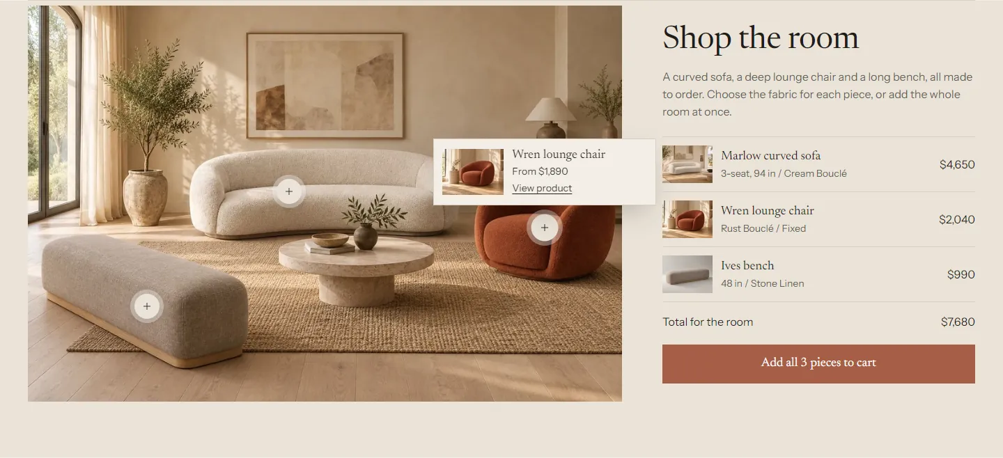
A room photo with a dot on each product. A dot opens a small card with the product's name, price and link. Beside the photo, a list shows every product, the room total and an "Add all to cart" button. Up to 8 Hotspot blocks.
| Setting | What it does |
|---|---|
| Image, Image description | The room photo and its description for screen readers. |
| Image shape | Landscape, Classic or Square. |
| Image position | Left or Right. |
| Heading, Text | Shown beside the image. |
| Show "Add all to cart" | Adds each product's first available variant. The list shows which variant that is. |
Each Hotspot has Product, Horizontal position and Vertical position (0 to 100%). Hotspots without a product are hidden on the live store. Until at least one hotspot has a product, the live store shows only the photo, heading and text, and the theme editor shows placeholder rows where the products will go.
Testimonials #
Customer or press quotes. Add Quote blocks (up to 6) with Quote, Name, Publication or product and an optional Publication logo that replaces the publication name.
| Setting | What it does |
|---|---|
| Heading | Default "What people say". |
| Layout | Columns with rules, Columns, or One large quote. |
| Columns on desktop | 1 to 4. |
On phones, the quotes swipe sideways. Nothing moves on its own.
A new Quote block starts empty. The theme editor shows placeholder text in it, and the live store leaves it out until you write the quote. If no quote has text, the whole section stays hidden on the live store.
Showroom #
An image beside your showroom details: a heading, text, Location blocks and a button. Up to 10 blocks. Each Location block has Name, Address, Opening hours and Directions link (a link to the address on a map service).
| Setting | What it does |
|---|---|
| Image, Image description | A photo of the showroom. |
| Image position | Left or Right. |
Video #
A video with a poster image and a play button. The video loads only when the shopper presses play. Up to 4 blocks over or beside it.
| Setting | What it does |
|---|---|
| Video | Upload a video, or use a YouTube or Vimeo link below. |
| YouTube or Vimeo link | Used when no video is uploaded. YouTube videos load from the privacy-enhanced domain. |
| Description for screen readers | Describes the video for screen readers. |
| Poster image | Shown until the video plays. Defaults to the video's preview image. |
| Play muted in a loop when in view | Off by default. Shoppers can pause it. |
| Shape | Widescreen, Cinema or Classic. |
| Full width | Edge to edge. |
Newsletter #
An email signup that adds customers to your Shopify customer list with marketing consent. Up to 5 blocks.
| Setting | What it does |
|---|---|
| Layout | Centered, or Text and form side by side. |
| Field style | Underline or Box. |
| Button label | Leave empty to show an arrow. |
Contact form #
A contact form with name, email, optional phone and topic menu, and message. Blocks on the left side hold text and Location blocks. Up to 8 blocks. Shopify sends each message to your store's contact email.
| Setting | What it does |
|---|---|
| Heading | Default "Send us a message". |
| Show phone number field | Adds an optional phone field. |
| Show topic selector, Topics | A menu of topics. Enter one topic per line. |
| Note beside the button | For example how soon you reply. |
| Message after sending | Shown after the form is sent. |
Custom Liquid #
Adds your own Liquid, HTML or app code. Available on every page.
| Setting | What it does |
|---|---|
| Liquid code | Add app snippets or other code. Liquid has access to the page's objects. |
| Full width | Ignore the page margins. |
Product page sections #
Product #
The main product section: the gallery on one side and the buy column on the other. The buy column holds blocks: Product title, Price, Lead time, Variant picker, Buy buttons, Dimensions, Description, Sticky add to cart, Custom Liquid, app blocks and the general content blocks. See blocks.
| Setting | What it does |
|---|---|
| Gallery width on desktop | Half, Large or Extra large. |
| Gallery position on desktop | Inside the page margins, or To the edge of the screen (the gallery meets the header and the screen edge). |
| Keep the buy column in view while scrolling | The buy column stays in view next to a long gallery. |
Combined listings (Shopify Plus): when a shopper picks an option value that belongs to another product in a combined listing, the section loads that product in place, with its gallery, title, price, options and buy buttons, and the page address changes to it. The sections below the product follow.
Featured product #
One product with its gallery and buy column, for the home page or any other page. It takes the same blocks as the Product section, so shoppers can pick a fabric and add to cart without leaving the page. The title links to the product page.
| Setting | What it does |
|---|---|
| Product | The product to show. |
| Gallery width on desktop | Half, Large or Extra large. |
| Image position on desktop | Left or Right. |
Product details #
A heading column and collapsible Detail row blocks (up to 12) for the description, dimensions, materials and care, delivery and your own text. See dimensions and detail rows.
| Setting | What it does |
|---|---|
| Heading | Default "The details". |
| Text | Optional text under the heading. |
| Image | Optional. Shown under the heading on desktop. |
Complete the set #
The other products in the product's group. See complete the set.
Recommendations #
Product cards that Shopify recommends for the current product. The section loads shortly before it scrolls into view.
| Setting | What it does |
|---|---|
| Heading | Default "You may also like". |
| Products | Related: picked by Shopify from your store's data. Complementary: products you choose per product in the Search and Discovery app. |
| Products to show | 2 to 10. |
| Columns on desktop | 2 to 5. |
When there are no recommendations, the section takes no space on the live store. New stores often have no related products yet: Shopify needs some order history. Complementary products show as soon as you set them in Search and Discovery.
Recently viewed #
The products a shopper looked at most recently, newest first, without the current product. The list is kept in the shopper's browser, not on your store. The section stays hidden until they have viewed another product. It's also on the cart page.
| Setting | What it does |
|---|---|
| Heading | Default "Recently viewed". |
| Products to show | 2 to 8. |
| Columns on desktop | 2 to 6. |
Products hidden from your store's search don't appear here, because the section looks them up through search.
Template sections #
These sections belong to one template. See templates for where each one is used.
Collection banner #
The top of a collection page: title, description and an image. Settings: Show description, Show image, Image (leave empty to use the collection image), Layout (Text and image side by side, or Wide image above the heading) and Image shape (Panorama, Wide or Landscape).
Product grid #
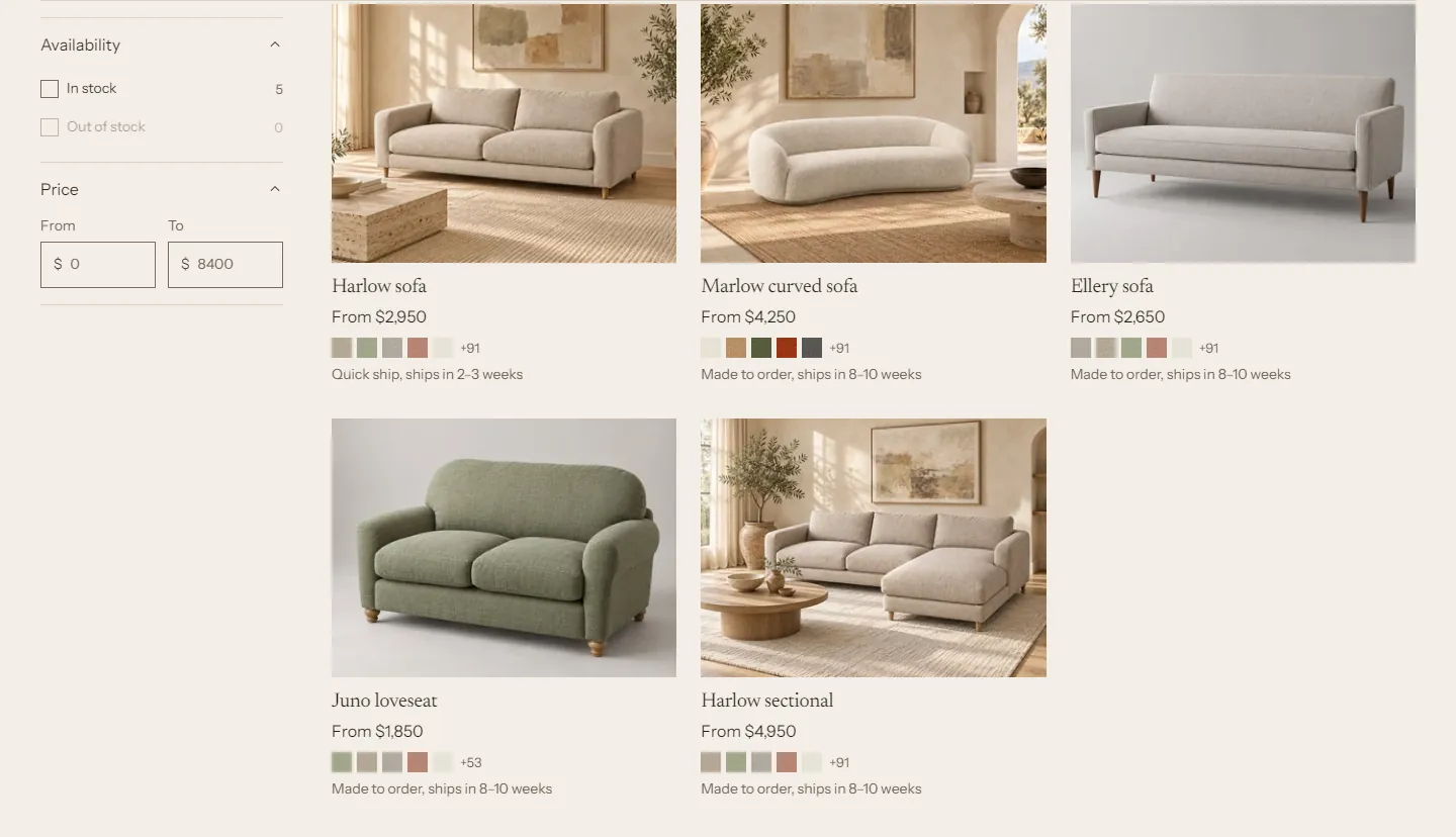
The products on a collection page, with filters and sorting.
| Setting | What it does |
|---|---|
| Products per page | 6 to 48. |
| Columns on desktop | 2 to 4. |
| Columns on mobile | 1 or 2. |
| Pagination | "Load more" button or Page numbers. |
| Filters and sorting > Show filters | Set up filters in the Search and Discovery app. |
| Filters on desktop | Sidebar or Drawer. On phones, filters always open in a drawer. |
| Show sorting | A sort menu above the grid. |
Search results #
The search page: a search field, then results with the same filters, sorting and pagination as the product grid. Settings match the Product grid, with Results per page.
Cart #
The cart page. Product lines show their options with fabric swatches and the live lead time. Samples are grouped below them.
| Setting | What it does |
|---|---|
| Show the longest lead time | The longest lead time of the products in the cart. Updates as the cart changes. |
| Lead time note | Default "Your order ships together when the last piece is ready." |
| Show order note | A note field the shopper can open. It saves as they type. |
| Show dynamic checkout buttons | Shows the express payment methods you have turned on, such as Shop Pay. |
| Continue shopping link | Optional. |
| Empty cart > Heading, Text, First link label, First link, Second link label, Second link, Third link label, Third link | What an empty cart shows, with up to three links. |
Cart drawer #
The cart that slides in from the side. It has no settings of its own: it follows Theme settings > Cart and Drawers and dialogs in Colors.
Fabric library #
See fabric library page.
Page #
The title and content of a page. Settings: Alignment, Text width (30 to 60 rem), Image and Image shape.
Blog posts #
A blog's list of posts: tag links, the newest post as a large feature on the first page, then a grid. Settings: Feature the newest post, Show tag links, Posts per page (4 to 24), Columns on desktop.
Blog post #
One article: blog link, date, author, reading time, image, the text, tags, comments (when the blog allows them) and three more posts. Settings: Image shape, Show author, Show reading time, Show more posts from the blog.
Collections list #
All collections as image tiles. Settings: Heading, Text, Collections (leave empty to show every collection with products), Collections per page (6 to 48, when the collections setting is empty), Order (As picked above, Alphabetical, Most products first, Fewest products first), Columns on desktop, Image shape, Show product count.
Page not found #
The 404 page: heading, text, a search field, up to three links and an image. Settings: Heading, Text, Show search, First link label, First link, Second link label, Second link, Third link label, Third link, and Image.
Password page #
What visitors see while your store is password protected: store name, heading, message, an image, a newsletter signup and the password form behind "Store owner? Enter the password".
| Setting | What it does |
|---|---|
| Store name | Leave empty to use the store name. |
| Heading | Default "Opening soon". |
| Message | Used when the password page has no message in Online Store preferences. |
| Show newsletter signup, Signup note, Button label | The signup form. |
Sections without settings #
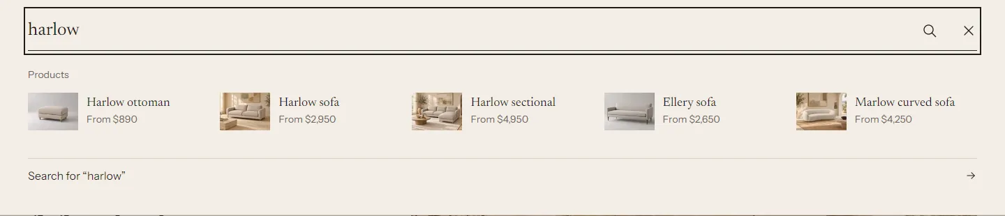
Fabric dialog (the "View all fabrics" panel) and Predictive search (the search suggestions) are loaded by the theme when a shopper opens them. They don't appear in the editor's section list.